Wotsay
Project Description
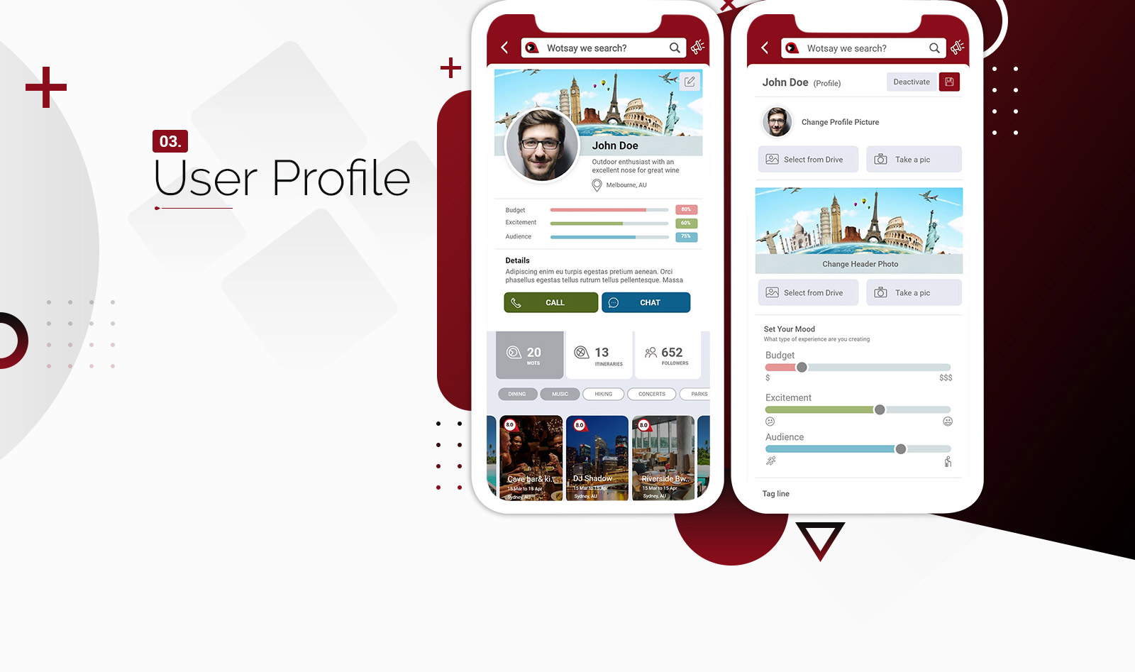
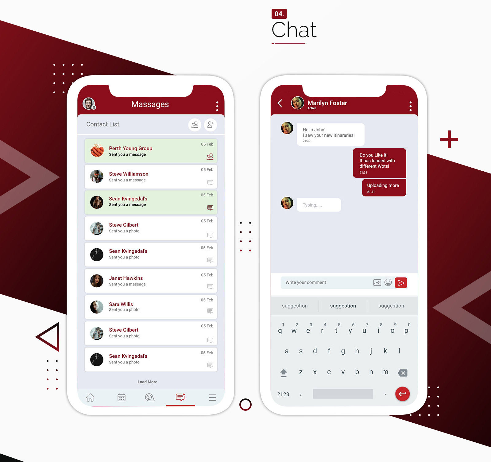
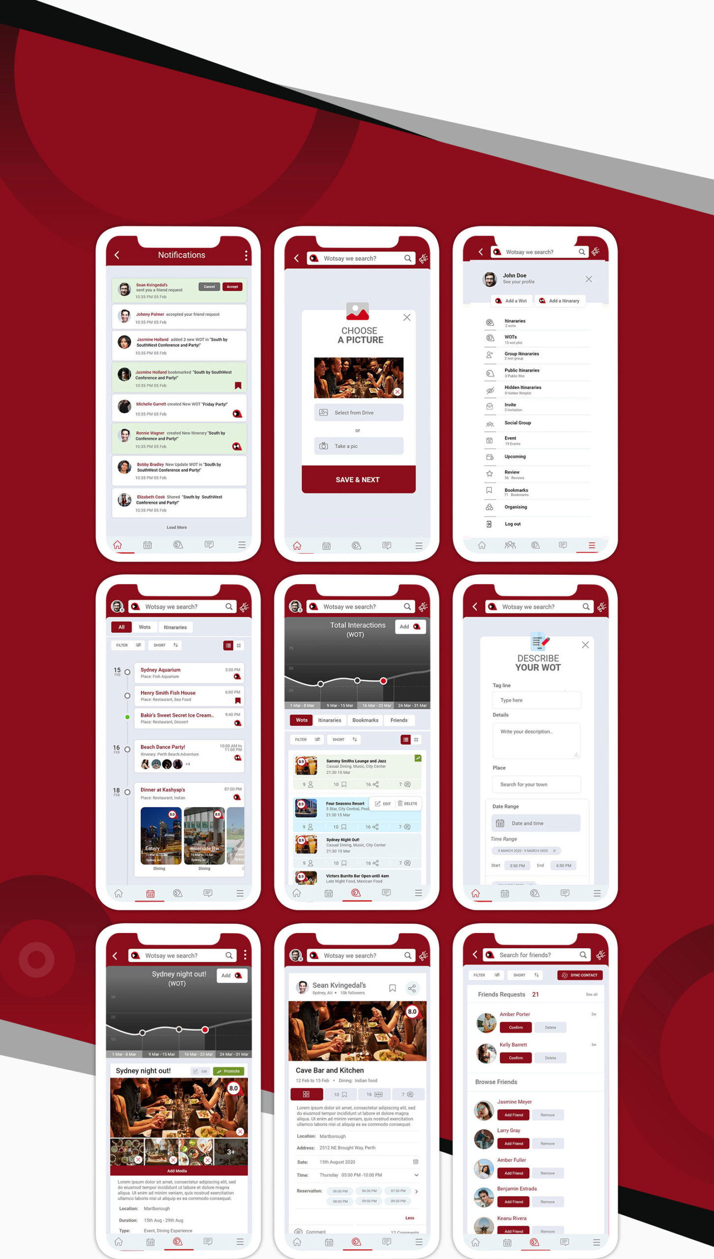
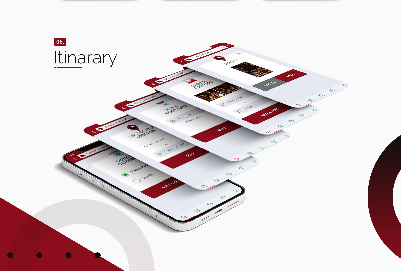
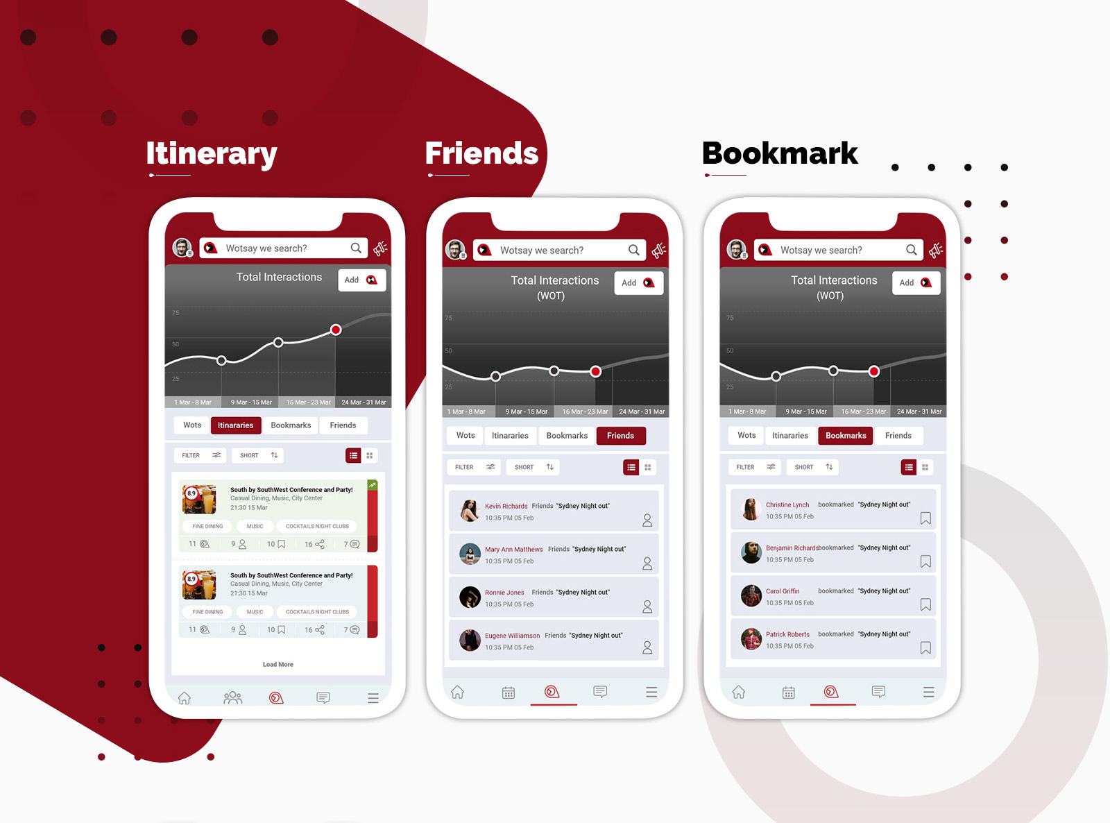
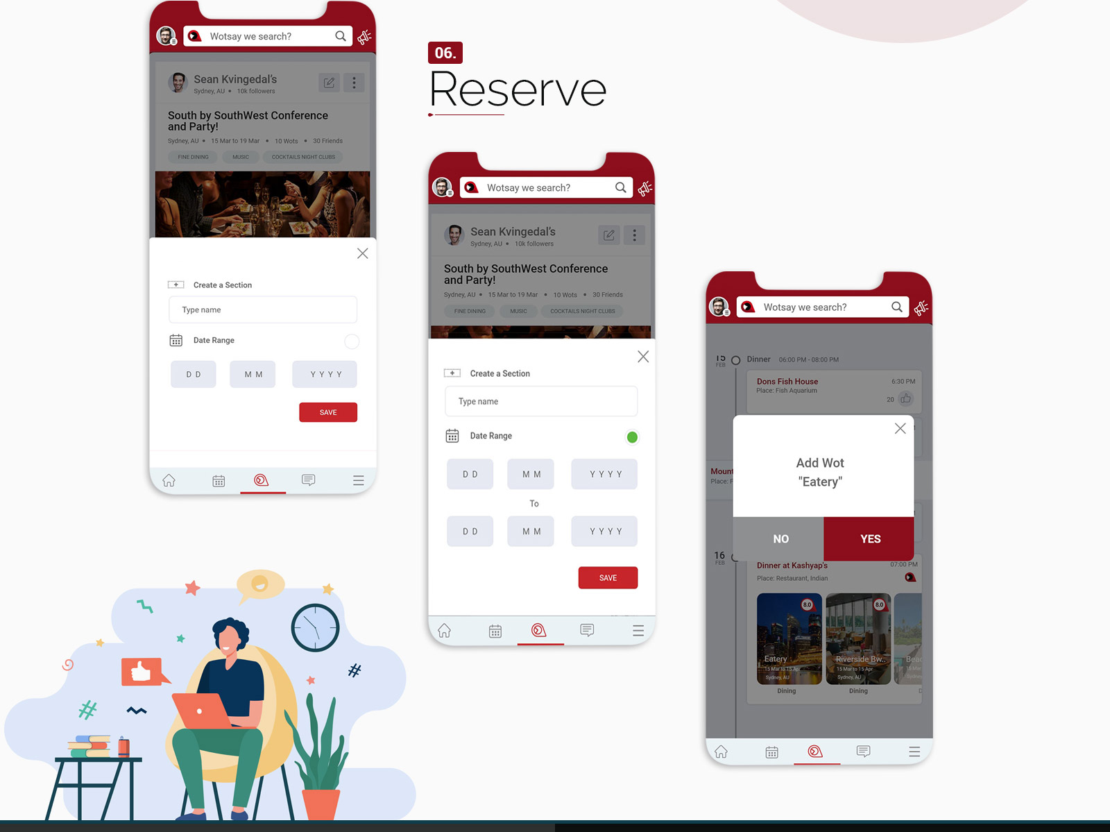
The business was about creating an annual plan for users for activities / venues / events they want to attend and the app will provide this information much faster for users for the day, week or month ahead.
The name is Wotsay.. – because in English a common way of suggesting something to do is to say “what say we go to the river this afternoon” or “what say we all meet for dinner”
The name is Wotsay.. – because in English a common way of suggesting something to do is to say “what say we go to the river this afternoon” or “what say we all meet for dinner”
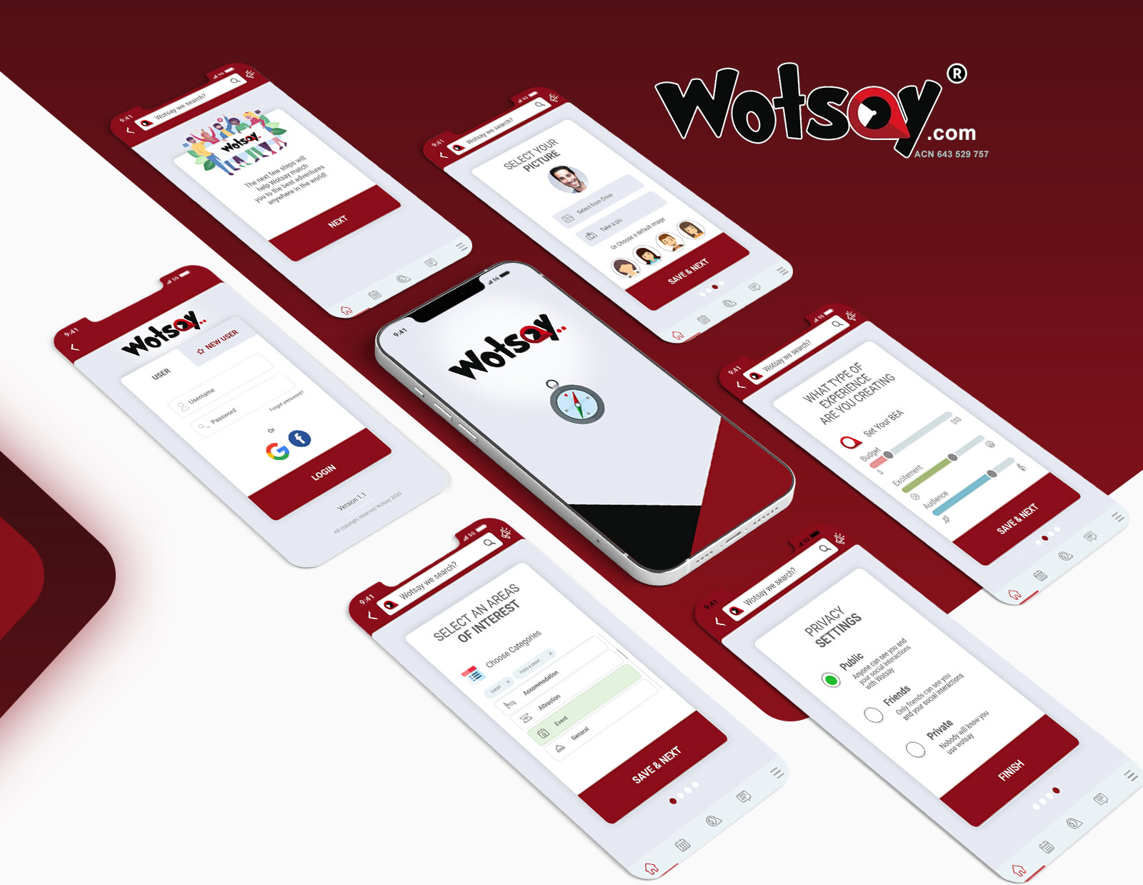
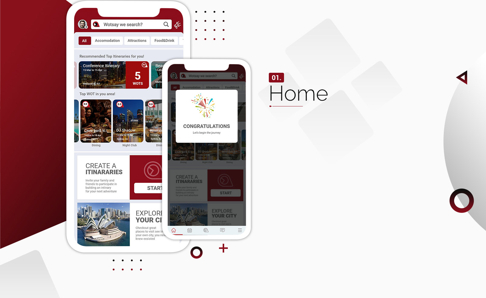
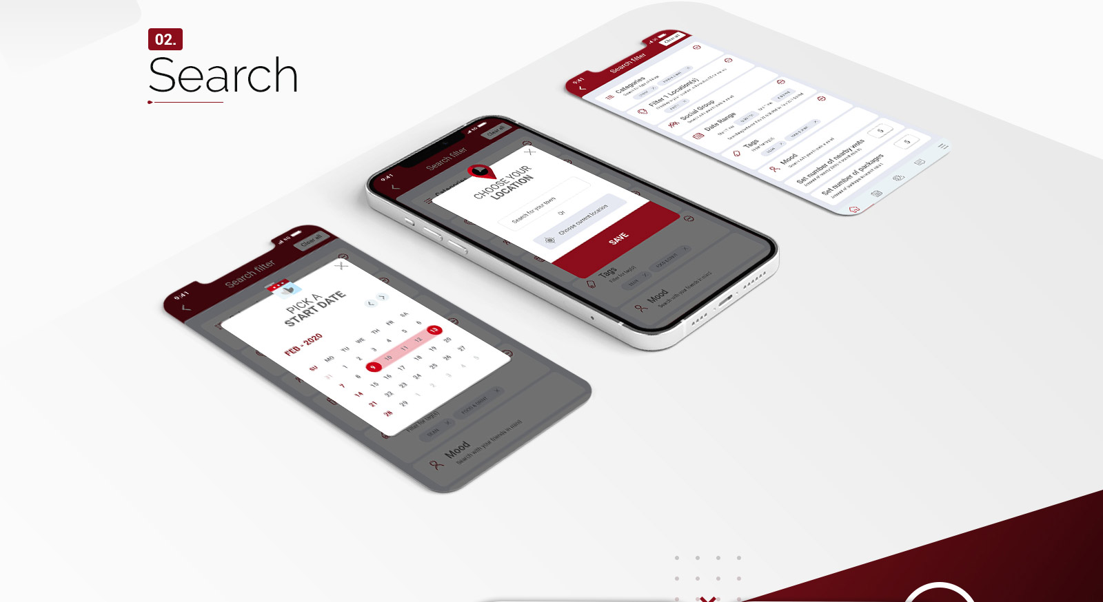
Creating App and UI Design for Wotsay was the major task alloted to us.
We designed the wireframe firstly. After the approval from the clients end, our team took on to developing the app accordingly. This was a planned, organized and perfect work that gave birth to an app which is light, faster and user-friendly.
Technology
Angular8, Apache Cordova, Ionic4
Duration
27 Days
Project For
Wotsay
Project Category
Logo, Branding, Web
Requirements elicitation is the process of generating a list of requirements (functional, system, technical etc.) from the various stakeholders.
A Wireframe is a layout of a web page that demonstrates what interface elements will exist on key pages.
Design Tools are objects, media or computer programs which can be used to design.
Typography is the art and technique of arranging type to make written language legible, readable and appealing when displayed.
Desktop View refers to a web page view seen through a browser in a desktop computer.
A mobile responsive design is when a website is displayed on a mobile device and it automatically adjusts to display in a legible manner on the device.
Get in touch


Lets get in touch
We're open for any suggestion